Making my book
- hannahcranshaw
- Jan 12, 2019
- 3 min read

Updated: Jan 17, 2019
When it came to creating my book I thought the first step was to decide what I was going to make it out of. I chose to use mount board as the front and back cover instead of wood as I was worried that the wood could be to bulky. I decided to use white card to make the book clean as I've mentioned previously.
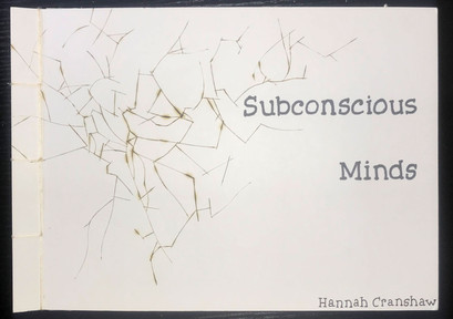
I wanted to create something different with the front cover, I didn't want to put an image in the book to make it different yet enticing. I knew straight away that I wanted to create a shattered effect. I created the effect by screwing up a piece of tracing paper from the centre then drew over some of the creases then traced it onto the mount board. Then burnt into the mount board using a wood burning tool.
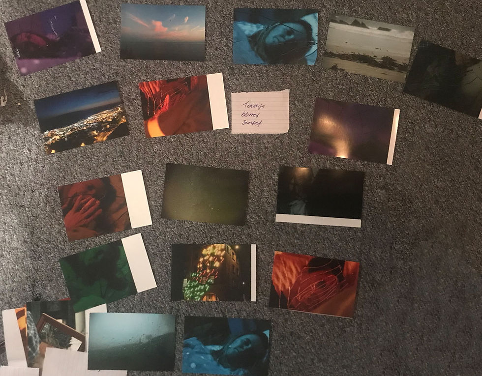
When deciding on a layout for the book I printed all the images out in 6x4 and laid them all out and decided on a an oder by choosing what images worked well together and what images I wanted to get rid of.
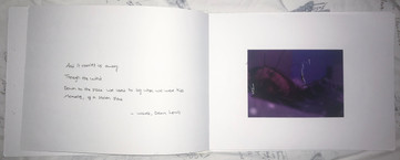
I knew from the beginning that I wanted to add text in the book to give a little more context to my images but I wasn't sure what. After a lot of thought I decided to use song lyrics. I know that a lot of people zone out a lot whilst listening to music, myself included. I thought that this adds context to the images without trying to tell people what is going on. I picked a few songs lyrics that have similar connotations to each different mood in my images. Then I carefully selected which ones worked best.
I made a mock book so that I knew if my ideas were going to work or not. It turned out really well and I had no problems making it, I used slightly different paper as it was cheaper but I wish I had made the extra purchase as I would have discovered how hard it would have been to bind due to the thickness (as I explain later on).


I tried out a few fonts, to start I tried a floaty font as I wanted to create a whimsical and mysterious but after making the mock book I realised that the font I was using for the front cover wasn't strong enough.
After looking online at different fonts I decided I needed something bolder and that's when I decided to try an old-fashioned typewriter font as music and poems are often shown in these fonts. I decided to hand write the lyrics as I thought it went well with the personal hand made feel of the book.

I placed the images out again before sticking them in my book incase I changed my mind.
I was going to use glue to stick the images down but I quickly released that was going to be a messy and unsuccessful method. I had to re print some of my image as I got glue on them.
So I chose to swap to double-sided sellotape which I found to be a much more effective method ( I just had to be a lot more careful when getting my photos in the right place).
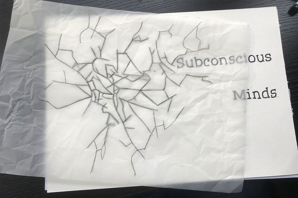
I decided on the layout of the cracks by placing the tracing paper over the front cover with the title already written and moved it around until I was happy with the placement. Then went in with the woodturning tool trying to carefully stick to the lines I had drawn out.
I used Japanese stab binding to bind my book and when I made my prototype it was really easy to bind but when it came to making the real thing, I struggled a lot more I knew that it would be thicker as I was using slightly thicker card but it made it much harder. Next time I will use a thicker needle as towards the end it started to bend under the pressure, this might also help me bind the book quicker.


Comments